Infrequent It’s not uncommon for something as well-known as the Happy Hacking Keyboard to be completely reworked, and when it does, these changes are usually criticized by longtime fans — think Porsche switching from air-cooled to water-cooled engines with the 911, or Microsoft moving to a more tablet-like interface with Windows 8. When people are used to something, they don’t like to see it dramatically change, whether that ultimately is for better or worse.
The latest edition of the Happy Hacking Keyboard (HHKB) brings some significant changes to the model’s nearly 30-year history, and it’s easy to look at it in that same light. Aside from the layout, nearly every aspect of this keyboard has changed, and thankfully, many of these changes feel like an improvement over previous versions.
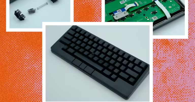
The HHKB Studio is a hot-swappable 60% mechanical keyboard with Bluetooth connectivity, an integrated touchpad, built-in trackpoint, and a unique programmer-friendly layout. The Studio features a PBT plastic case and keycaps, multi-device connectivity, and keymap customization via the company’s proprietary Keymap Tool software. But before we dive into this new iteration, we need to look at its legacy.
Decades of tradition
The Happy Hacking Keyboard has been around for decades. It was designed around the idea of a single, specialized, long-lasting keyboard that could be used across multiple computers and operating systems (a novel and new idea at the time). Since then, it has been regularly upgraded, further improving its unique layout and multi-device utility.
The first model of HHKB pioneered a unique layout, cutting the keys in the bottom corners, moving the backspace/delete key and adding a second key to the top right, and replacing the Caps Lock key with a Control key that could be easily operated with the pinky finger. In subsequent iterations, the keyboard changed from the traditional rubber dome layout to Topre capacitive switches, added USB pass-through, and finally introduced Bluetooth connectivity. Throughout all generations, however, the unique layout has remained constant. The latest model stays true to the layout, but nearly every other aspect of the keyboard has changed.
Photo: Henri Robbins
One of the HHKB’s most distinctive elements is its Topre capacitive switch, which uses a rubber dome resting on a conical metal spring to create rounded bumps and a soft feel. The HHKB is one of the few keyboards to feature this switch, which was both a blessing and a curse. The switch was unique and fun to type on, but at the same time, the rarity and unique construction of Topre switches made modding the switches and keycaps much more difficult. Instead of being able to remove and replace individual switches, modding required disassembling the entire keyboard.
Now, HHKB Studio is edging closer to the world of modular keyboard design by adopting the MX-style switches that have become nearly universal on modern mechanical keyboards. However, rather than sticking with existing mechanical switches, the company has worked with well-known aftermarket switch manufacturer Kailh to design its own MX-style switches.
Other notable changes include a new trackpoint in the centre of the keyboard, low-profile mouse buttons below the spacebar, and touch-sensitive “gesture pads” on the front and sides of the keyboard. The HHKB Studio also retains the wireless functionality of the previous generation, with extensive use of PBT plastic for the case and keycaps. Bluetooth functionality is bolstered by an LED bar on the top left of the keyboard, and the quick-adjust dip switches on the rear are now hidden behind the battery cover.
Typing sensation
The HHKB Studio’s switch from Topre to MX-style switches is a controversial change. Some may argue that they “sold out” by moving to MX-style switches, but that would be ignoring an important detail: these switches are wonderful Easy to type on. The unique sound and feel of a Topre Tactile switch is combined with the smoothness of a modern linear switch to create a quiet linear that produces a soft, deep, and satisfying bottom out. I’ve never seen anything like it. For fans of Topre switches, I think this is the best linear switch out there.
Taking the switch apart, we see that it appears to have a similar construction to Kailh’s clicky switches. Specifically, the design is reminiscent of the Box Navy and Box Jade switches. The only major difference is that they’ve removed the actual click mechanism (a small spring called the “click bar” that adds a tactile nub and sound when pressed) and added an acoustic pad to the bottom of the switch housing.

